


Tips for IELTS Academy Writing Task 1
The task here is to describe a graph in a report. The report is intended for a university lecturer, so the language you use should be appropriate.
The following figures illustrate all types of graph:
The Body should describe the most important trends, while all the information is summarized to avoid unnecessary details. For example, if there is a graph that has 2 peaks, you should mention them; say when those peaks appeared and what the peak values are.
Notice how many distinctive features the diagram has and divide the information into paragraphs, one paragraph for one feature (or a group of similar features). You should link the paragraphs by sentences that logically connect them to one another.
Important! You need to write about all the periods of time and all the subjects of the graph. If it shows several years (1992, 1993, 1994) - write about all of them, if it is about men and women -write about both. Remember, summarizing doesn't mean throwing away information. The secret here is to select what's important, organize it, compare and contrast.
The Conclusion should sum up the global trends shown and compare them if possible.
Your opinion shouldn't appear anywhere in the report. You also shouldn't include other information, that doesn't appear on the chart. This kind of writing can be (and probably will be) penalized!
1) Happened in the past
OR
2) Continued in the past
OR
3) Happens in the present
Example:
"Books sold in 2001 by categories" - happened in the past (1)
"The way people were spending money on clothes between 1999 and 2003" - continued in the past (2)
"Unemployment figures amongst women" - happens in the present, when there is no time stamp we assume the present (3)
You need to use correct tenses:
Sample answer.
The graph shows percentages of unemployed women at 8 ages. It can be clearly seen that the ages 18 and 45 have the highest unemployment rate.
According to the graph, among the ages 18, 20, 25, 30 and 35, the youngest women have the highest unemployment percentage (15%). 20 year-old women have much lower unemployment figures (about 10%), and percentages drop even lower (to 5 percent) for those aged 25 and 35. There is a slight increase for those aged 30, where the unemployment rate reaches 6 percent.
The peak value is recorded amongst 45 year-old women, and all the remaining ages have much lower figures: 8% at age 55 and 9% at age 65.
To sum up, the figures for most ages are relatively uniform and change from 5 to 9 %, with rare exceptions such as the ages 18 and 45
In the next paragraph, if the 2 graphs are similar, write "Similarly," and describe the other graph. If the 2 graphs are different, write "In contrast," and describe the other graph.
You should also compare the peaks and troughs of the two graphs, see example below.
The graph below shows the amounts spent on clothes on the Internet in the USA and Japan between 1999 and 2003.
Write a report for a university lecturer describing the information shown below.
You should write at least 150 words.
In 1999 Japan was spending on clothes almost twice as much as the USA (10 versus 5 million dollars). In the following year the expenditure on clothes in both Japan and USA grew even further to 12 and 10 million dollars respectively.
The only year when expenses plunged in both countries was 2001, when the USA spent only 8 and Japan reached its lowest point at 7 million.
The two following years, 2002 and 2003 showed a rapid increase in sales of clothes in both countries. In 2002 the USA spent about 19 million dollars and Japan's numbers were very close (18 million). Online clothes sales became even more popular in 2003, pushing the figures higher to its peak of 20 million dollars in both Japan and the USA.
"The graph describes/shows/reveals ... (what, who, when, where). It can be clearly seen that ... (describe main trends here).
For multiple bars graphs
"The graph compares ... (what, who, when, where). It can be clearly seen that ... (describe main trends here).
The bar chart below shows figures of annual coffee and meat consumption.
Write a report for a university tutor describing the information shown.
You should write at least 150 words.
It can be clearly seen that the lowest rates of coffee consumption are recorded in China and Japan (2 and 3 kg per person respectively). The next three countries have higher rates, consumption of coffee in the USA totals 4 kg per person, while France and Russia have equal consumption rates of 5 kg per person. The highest numbers belong to Germany and Norway, at 7 and 9 kg per person respectively.
Meat consumption numbers are much higher in all countries; the highest numbers are recorded in the USA (122 kg per person) and the lowest in Japan. Meat consumption in Russia (45) and China (47) is similar to that of Japan (42). Three other countries have much higher numbers, starting with Norway (60) and progressing through France (72) to Germany which consumes about twice as much as Japan (87 kg per person).
In conclusion, the report shows that the Asian countries have similar consumption numbers for both coffee and meat.
The chart below describes books sales of Famous Book Store in 2001.
Write a report for a university tutor describing the information shown.
You should write at least 150 words.
The two dominant categories, parenting (25 %) and cooking (22 %) are followed very closely by psychology, with only 4 percent less sales than for cooking books. Sales of fantasy and gardening literature recorded much smaller figures, 11 and 13 percent respectively. Books on Technology or Investment were the two least popular categories, with only seven percent of sales being on books about Investment and 4 percent on books on Technology.
Most of the books were sold to women and men from 25 to 50 years old (23 and 28 percent respectively). Sales figures amongst women older than 50 or younger than 25 as well as among men over 50 were very similar, 12 and 14 percent. Only 9 % of the books were purchased by men under 25.
The table below describes victims by age group and offence category in Venezuela, 1999.
Write a report for a university lecturer describing the information shown.
You should write at least 150 words.
The largest numbers of citizens were victims of either robbery or kidnapping, with over 4500 and 56 cases respectively for people over 15 and under 24 years old. These numbers reduce though by 25% (to 3312 and 48 respectively) as we move to age group 25 to 44 and reduce even more for ages 45 - 64, dropping to 1067 cases of robbery and 16 kidnappings. Figures for blackmail and murder victims show a very similar tendency to increase as we move from the 0-14 to the 25-44 age group, where they peak at 89 and 72 respectively.
Another noticeable feature is that the majority of the victims belonged to ages from 15 up to 64 for all kinds of offences, with the exceptions of negligence and kidnapping, where most of the victims belonged to the 0-14 age group.
The diagram below shows how online purchases are made.
Describe the process of online purchase.
You should write at least 150 words.
First, the online order is placed together with the credit card number to enable the required funds to be withdrawn. Then a request to check the validity of the credit card (by checking that the customer is its real owner) and sufficiency of funds is received by the Credit Company. As a result, the credit card is either approved or denied by the company.
If the credit card is approved, the customer's order is fulfilled by the merchant. After that, the purchase amount is requested by the merchant from the Credit Company and finally, money is received by the merchant.
Alternatively, in cases when the credit card is denied by the Credit Company, notification is sent to the merchant advising them not to supply the goods. Next, the order is declined by the merchant and after that notification is sent to the customer.
Mọi thông tin chi tiết, các bạn vui lòng liên hệ:
DU HỌC UNIGLOBE
10/3 Nguyễn Thị Minh Khai, Phường Đa Kao, Quận 1, TP.HCM
ĐT: (08) 35 173 345 – 35 173 678
Email: info@uniglobe.edu.vn
Website: www.uniglobe.edu.vn
Types of graph for the report
There are several different figures you could see in the Writing 1 Task:- Single line graph
- Double line graph
- Bar graph (Single, Double or Triple bar graph)
- Pie chart • Table
- Process diagram
The following figures illustrate all types of graph:
Table
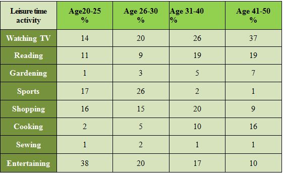
Leisure time activities amongst women of various age groups
Process diagram
Universal rules
No matter what figure you are describing, you shouldn't break these rules:- Your report must be of at least 150 words written in 20 minutes
- You shouldn't write your opinion or copy words from the graph - rephrase and use synonyms instead.
- Never use bullet points, write as if you were writing an essay.
What does a good report look like?
When your Academic Writing 1 Task is graded by IELTS examiners, they look for this structure:- Introduction (1 paragraph)
- Body (may consist of 2-3 paragraphs)
- Conclusion (1 paragraph)
The Body should describe the most important trends, while all the information is summarized to avoid unnecessary details. For example, if there is a graph that has 2 peaks, you should mention them; say when those peaks appeared and what the peak values are.
Notice how many distinctive features the diagram has and divide the information into paragraphs, one paragraph for one feature (or a group of similar features). You should link the paragraphs by sentences that logically connect them to one another.
Important! You need to write about all the periods of time and all the subjects of the graph. If it shows several years (1992, 1993, 1994) - write about all of them, if it is about men and women -write about both. Remember, summarizing doesn't mean throwing away information. The secret here is to select what's important, organize it, compare and contrast.
The Conclusion should sum up the global trends shown and compare them if possible.
Your opinion shouldn't appear anywhere in the report. You also shouldn't include other information, that doesn't appear on the chart. This kind of writing can be (and probably will be) penalized!
"Time stamp" and grammar
The figure you need to write a report about always has a "time stamp" on it. This "time stamp" says to us that graph describes something that1) Happened in the past
OR
2) Continued in the past
OR
3) Happens in the present
Example:
"Books sold in 2001 by categories" - happened in the past (1)
"The way people were spending money on clothes between 1999 and 2003" - continued in the past (2)
"Unemployment figures amongst women" - happens in the present, when there is no time stamp we assume the present (3)
You need to use correct tenses:
- Happened in the past - use past simple.
- Continued in the past - use past continuous.
- Happens in the present - use present simple or present continuous.
Single line graph
How to start
"The graph describes/shows/reveals ... (what, who, when, where). It can be clearly seen that ... (describe main trends here).Vocabulary
When describing such a graph, all you can say is that it either rises (increases, climbs, goes up), falls (decreases, declines, drops, goes down), doesn't change (remains at the same level, maintains stability). The highest point of a graph is a peak and the lowest is the lowest point. The speed of change also matters - you should say how fast (rapidly, quickly) or how slowly (gradually, steadily) it happened. And, of course, there is order to changes - a rise was preceded by a drop and followed by a decline.How to describe trends
Numbers are boring, so you need to add a little "color" when describing them. By "color" I mean comparison. Don't just write "went from 100 in 1999 to 255 in 2001". Write "increased by 155" or "had risen to 255".Single line graph sample task
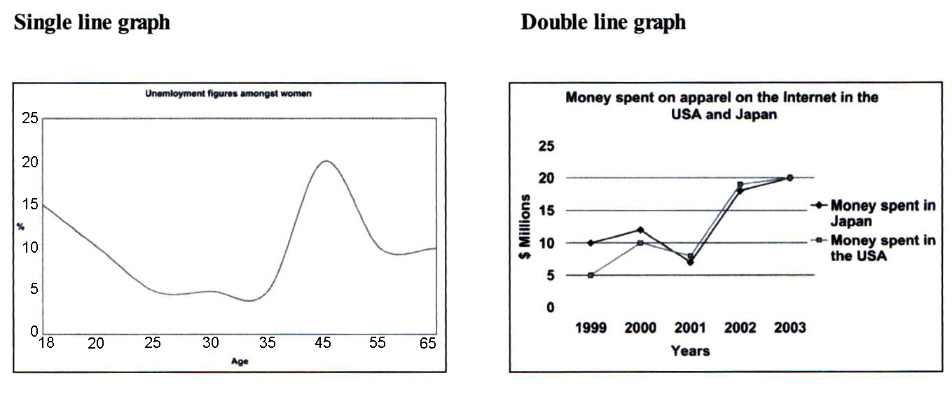
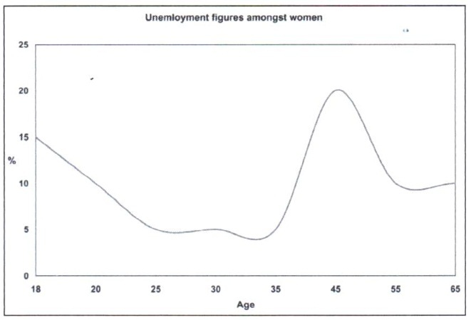
You should spend about 20 minutes on this task.The graph below shows the unemployment figures amongst women of different age groups.
Write a report for a university lecturer describing the information shown below.
You should write at least 150 words.Sample answer.
The graph shows percentages of unemployed women at 8 ages. It can be clearly seen that the ages 18 and 45 have the highest unemployment rate.
According to the graph, among the ages 18, 20, 25, 30 and 35, the youngest women have the highest unemployment percentage (15%). 20 year-old women have much lower unemployment figures (about 10%), and percentages drop even lower (to 5 percent) for those aged 25 and 35. There is a slight increase for those aged 30, where the unemployment rate reaches 6 percent.
The peak value is recorded amongst 45 year-old women, and all the remaining ages have much lower figures: 8% at age 55 and 9% at age 65.
To sum up, the figures for most ages are relatively uniform and change from 5 to 9 %, with rare exceptions such as the ages 18 and 45
Double line graph
How to start
"The graph compares ... (what, who, when, where). It can be clearly seen that ... (describe main trends of 2 graphs here).Vocabulary
The same as for the single line graph description.How to compare trends
In the body of the report start your first paragraph by describing the first graph.In the next paragraph, if the 2 graphs are similar, write "Similarly," and describe the other graph. If the 2 graphs are different, write "In contrast," and describe the other graph.
You should also compare the peaks and troughs of the two graphs, see example below.
Double line graph sample task
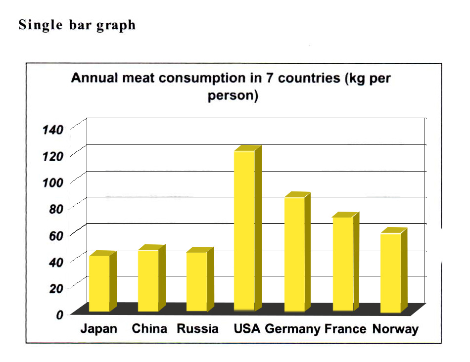
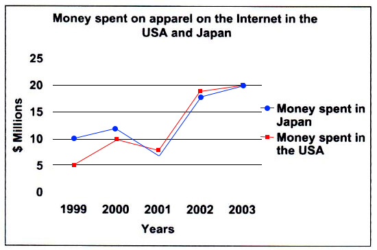
You should spend about 20 minutes on this task.The graph below shows the amounts spent on clothes on the Internet in the USA and Japan between 1999 and 2003.
Write a report for a university lecturer describing the information shown below.
You should write at least 150 words.
Sample answer:
The graph compares amounts of money spent online on clothes in the USA and Japan starting from 1999 and until 2003. It is clear that although at first Japanese buyers were spending much more money than Americans did; as the years went by the spending habits of the 2 countries became almost identical.In 1999 Japan was spending on clothes almost twice as much as the USA (10 versus 5 million dollars). In the following year the expenditure on clothes in both Japan and USA grew even further to 12 and 10 million dollars respectively.
The only year when expenses plunged in both countries was 2001, when the USA spent only 8 and Japan reached its lowest point at 7 million.
The two following years, 2002 and 2003 showed a rapid increase in sales of clothes in both countries. In 2002 the USA spent about 19 million dollars and Japan's numbers were very close (18 million). Online clothes sales became even more popular in 2003, pushing the figures higher to its peak of 20 million dollars in both Japan and the USA.
Bar graph
How to start
For single bar graph"The graph describes/shows/reveals ... (what, who, when, where). It can be clearly seen that ... (describe main trends here).
For multiple bars graphs
"The graph compares ... (what, who, when, where). It can be clearly seen that ... (describe main trends here).
Vocabulary
The same as for single line graph descriptions.How to describe or compare trends
If the axis of the bar graph is a time scale - describe how the graph's subject changes in time. Otherwise compare the bars differently - more, less, most, least, etc, in order of appearance.Bar graph sample task
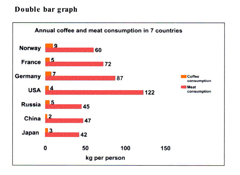
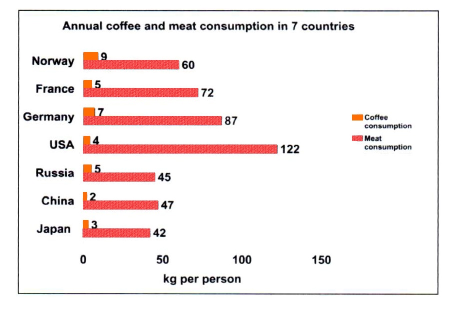
You are advised to spend a maximum of 20 minutes on this task.The bar chart below shows figures of annual coffee and meat consumption.
Write a report for a university tutor describing the information shown.
You should write at least 150 words.
Sample answer:
The bar chart compares the amounts of coffee and meat consumed every year in Norway, France, Germany, the USA, Russia, China and Japan.It can be clearly seen that the lowest rates of coffee consumption are recorded in China and Japan (2 and 3 kg per person respectively). The next three countries have higher rates, consumption of coffee in the USA totals 4 kg per person, while France and Russia have equal consumption rates of 5 kg per person. The highest numbers belong to Germany and Norway, at 7 and 9 kg per person respectively.
Meat consumption numbers are much higher in all countries; the highest numbers are recorded in the USA (122 kg per person) and the lowest in Japan. Meat consumption in Russia (45) and China (47) is similar to that of Japan (42). Three other countries have much higher numbers, starting with Norway (60) and progressing through France (72) to Germany which consumes about twice as much as Japan (87 kg per person).
In conclusion, the report shows that the Asian countries have similar consumption numbers for both coffee and meat.
Pie chart
How to start
"The pie charts compare... (what, who, when, where). It can be clearly seen that ... (describe the most noticeable feature)."Vocabulary
When describing a pie chart, write about the highest (significant, lowest) percentage, the greatest (smallest) proportion, the lowest number, the most (least) popular (common) item, etc.How to describe and compare pie charts
Describe and compare the pieces one by one. If a certain piece is two or three times bigger than another, you could write "twice (three times) as many Xs were used as Ys". Another idea is to write "X is much more (or considerably less) common than Y".Pie chart sample task
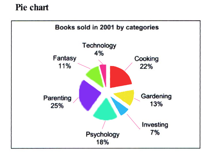
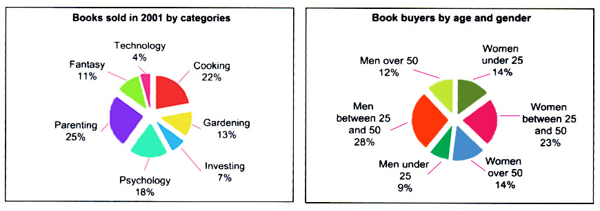
You are advised to spend a maximum of 20 minutes on this task.The chart below describes books sales of Famous Book Store in 2001.
Write a report for a university tutor describing the information shown.
You should write at least 150 words.
Sample answer:
The pie charts compare quantities of books of various categories sold to customers belonging to different age groups and gender during 2001 by Famous Book Store. It can be clearly seen that parenting books are the most popular and that the biggest proportion of books was sold to men between the ages of 25 and 50.The two dominant categories, parenting (25 %) and cooking (22 %) are followed very closely by psychology, with only 4 percent less sales than for cooking books. Sales of fantasy and gardening literature recorded much smaller figures, 11 and 13 percent respectively. Books on Technology or Investment were the two least popular categories, with only seven percent of sales being on books about Investment and 4 percent on books on Technology.
Most of the books were sold to women and men from 25 to 50 years old (23 and 28 percent respectively). Sales figures amongst women older than 50 or younger than 25 as well as among men over 50 were very similar, 12 and 14 percent. Only 9 % of the books were purchased by men under 25.
Table
How to start
"The table compares... (what, who, when, where). It can be clearly seen that ... (describe the most noticeable trend)."Vocabulary
The vocabulary is the same as for all previous figures. If a time period or date is not mentioned, assume the present.How to select and group information
The table you receive usually has a lot of categories. It is presented to you that way intentionally, to make describing all the categories in 20 minutes impossible. You must learn to group information and describe groups of categories rather than just discarding the information. You can do this by noticing similar trends and grouping them together.Table sample task
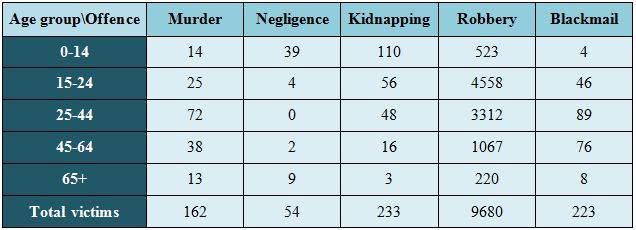
You are advised to spend a maximum of 20 minutes on this task.The table below describes victims by age group and offence category in Venezuela, 1999.
Write a report for a university lecturer describing the information shown.
You should write at least 150 words.
Sample answer:
The table shows statistics of people in five age groups who became victims of various crimes in Venezuela in 1999. It can be clearly seen that robbery was the most common type of offence across all of the age groups.The largest numbers of citizens were victims of either robbery or kidnapping, with over 4500 and 56 cases respectively for people over 15 and under 24 years old. These numbers reduce though by 25% (to 3312 and 48 respectively) as we move to age group 25 to 44 and reduce even more for ages 45 - 64, dropping to 1067 cases of robbery and 16 kidnappings. Figures for blackmail and murder victims show a very similar tendency to increase as we move from the 0-14 to the 25-44 age group, where they peak at 89 and 72 respectively.
Another noticeable feature is that the majority of the victims belonged to ages from 15 up to 64 for all kinds of offences, with the exceptions of negligence and kidnapping, where most of the victims belonged to the 0-14 age group.
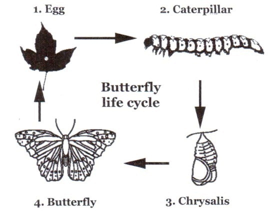
Process
How to start
"The flow chart/diagram describes/reveals the procedures of / for ..."Vocabulary
When describing a process, explain the sequence of stages/actions and use words like: firstly (secondly, thirdly), to begin with, then, after that, in addition, otherwise, at the same time (concurrently, simultaneously), finally.How to describe a process
Describe every stage of the process one by one, connect the stages by using linking words from the Vocabulary section (firstly, then, finally, etc), and mention whether or not there are stages that are being performed at the same time. You should also notice alternative stages (either stage A or B is performed). The main task here is to describe, not compare or contrast. Use present simple passive ("the letter is written" or "the research is conducted"). A conclusion paragraph is not necessary.Process sample task
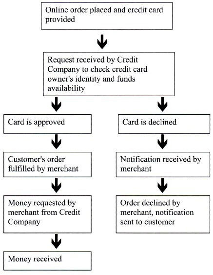
You are advised to spend a maximum of 20 minutes on this task.The diagram below shows how online purchases are made.
Describe the process of online purchase.
You should write at least 150 words.
Sample answer:
The flow chart shows the detailed process of making a purchase online, including the actions of the customer, merchant and Credit Company.First, the online order is placed together with the credit card number to enable the required funds to be withdrawn. Then a request to check the validity of the credit card (by checking that the customer is its real owner) and sufficiency of funds is received by the Credit Company. As a result, the credit card is either approved or denied by the company.
If the credit card is approved, the customer's order is fulfilled by the merchant. After that, the purchase amount is requested by the merchant from the Credit Company and finally, money is received by the merchant.
Alternatively, in cases when the credit card is denied by the Credit Company, notification is sent to the merchant advising them not to supply the goods. Next, the order is declined by the merchant and after that notification is sent to the customer.
Mọi thông tin chi tiết, các bạn vui lòng liên hệ:
DU HỌC UNIGLOBE
10/3 Nguyễn Thị Minh Khai, Phường Đa Kao, Quận 1, TP.HCM
ĐT: (08) 35 173 345 – 35 173 678
Email: info@uniglobe.edu.vn
Website: www.uniglobe.edu.vn


bình luận